Pages

Showing posts with label data. Show all posts

Wednesday, January 12, 2011

First Planck Results: The Sunyaev-Zeldovich Effect.


There's been many bloggers writing about the first Planck results presented here at AAS and in Europe but I would like to write a little more than has been written on the Sunyeav-Zeldovich results as I think they are impressive.  Impressive both in terms of the science we get as well as well as this particular example shows how precise CMB experiments have become.  I will focus on the results from this paper.

Okay, what is this effect anyways? The Sunyaev–Zel'dovich effect: "is the result of high energy electrons distorting the cosmic microwave background radiation (CMB) through inverse Compton scattering, in which the low energy CMB photons receive an energy boost during collision with the high energy cluster electrons."  And the thing is, clusters of galaxies are filled with high energy electrons in what is known as the intra-cluster medium (ICM).

This means that we can use specific distortions in the CMB to both locate clusters of galaxies and infer science from them from estimating the Hubble constant to extracting information on the physics driving galaxy and structure formation.

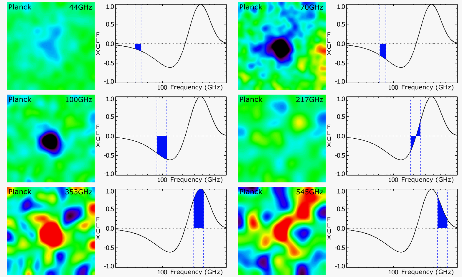
Look at the image above: it shows the precision at which Planck can observe this "SZ" effect.  (And it is just amazing!)  In this image you should note several things.  First, Planck intentionally is observing the sky at many frequency bands to see this stuff. (And watch the frequency change with tie in the image.)  At the lowest frequencies the boost on CMB photons yields a diminished flux, at higher frequencies it is an enhanced flux, and right at 217 GHz there is should be flux.

And if you look closely at the image up top you can see that Planck is seeing this!  The cluster in the center has diminished flux at low frequencies, denoted by the blue smudge,  no flux at 217 GHz and enhanced flux for high frequencies. (Now the smudge turns red.)  So Planck can see this effect really well and the science going into this effect can be studied in detail.

The next two plots to the right show how the mass and luminosity of these clusters relate to redshift. Redshift again being a measure of how far away these objects are from us.   These relations can now be compared to physical models and tell us a lot of science about the universe. Again, what is so great is Planck is seeing a lot of clusters and is able to see how the physical properties of these clusters relate with redshift. (Or as time progressed throughout the universe.)

Now, this stuff is all interesting but the really cool stuff, the main stuff Planck was built for, won't be released until next year. That should be a good day for cosmology and I for one am very excited! Cosmology has become a very precise science indeed!

Come in B-modes.... Come on! :)
ResearchBlogging.org
The Planck Collaboration. (2011). Planck Early Results: The all-sky Early Sunyaev-Zeldovich cluster sample Submitted to A&A. arXiv: 1101.2024v1

Tuesday, December 28, 2010

Why Raw Data From Science Experiments Can Scare Me.


Cosmology as a field has become precise enough that we may measure theoretical features at the 1/10 of 1% level or better.  For example, one of Planck's greatest successes could be a detection of what is known as primordial non-Gaussianity that, if it exists, is at most a deviation of less than 0.1% from a pure Gaussian spectrum.


With that in mind, let's look at some raw Planck data.  The image above left (black curve) shows raw data recorded by Planck as time goes by.   It has these features:
  1. You see the dipole of the CMB as a "sine-wave" signal as Planck rotates and scans the sky. (See video above for an illustration of this scanning pattern.)
  2. If you look closely,  you see a sharp peak at the same spot in each sine-pattern.  This is Planck observing the galactic plane.
  3. You also see hundreds of spikes that represent cosmic rays hitting the instrument.  
Now here is the point, all those spikes and other large anomalies are much more significant than deviations from a clean Gaussian signal on the order of 0.1%!  Here we are trying to find deviations on the level of 0.1% and the anomalies from false signals are significantly greater that this!

And so, Planck has to somehow remove them.   The graph on the top right shows what their data looks like when these known anomalies/systematics are accounted for.  It looks decent and gives what looks like a near-Gaussian spectrum modulo the peak from the galactic plane.  Hence, naively/hopefully in such data you can now go searching for 0.1% deviations.

But wait!!!

That clean signal assumes at least the following:
  1. That the simulations of the anomalies and the templates and models used for the removal of this stuff are more accurate that the 0.1% level.
  2. That the removal actually worked... beyond what looks good by eye.
  3. That in the process of removing garbage, Planck didn't inadvertently introduce other false signals.
  4. Etc...
And this "scariness" does not just exist for cosmology data.  For example, I have talked with many people working at the LHC who have admitted that their background issues they have to deal with in the data can be frightening in similar ways. 

Conclusion: Now, don't get me wrong, I have a lot of trust in the Planck team/LHC/whoever.  I really do.  But let's just say this still scares me a little.  Some of the most important results from in physics hinge on better that 1/10 of 1% accuracy in both removing false signals and in not introducing fictitious ones during such a removal process.  (And everyone in the trenches knows this can be really hard to get right!) Therefore, this sometimes seems like a scary business... but at the same time it is also a testament to how far we have come in science. :)

Friday, September 17, 2010

Motivation To Go To Grad School.

I was not motivated to go to graduate school for the money (despite this earlier post) or because of the state of the job market.  I wanted to go because I love physics and knew that in order to "be a physicist" studying the types of physics I was interested in I would need to get a PhD.


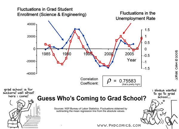
However, this plot made by PhD Comics gathered from from the Bureau of Labor and Statistics suggests that the state of the job market may be a major factor determining whether people decide to enter grad school or not.  As is noted, fluctuations in grad school enrollment in science and engineering and fluctuations in unemployment are strongly correlated.  When unemployment goes up, more people start going to grad school.

Thoughts?

Monday, August 30, 2010

The First 10^3 Posts

It's our 1000th post here at The Eternal Universe and what started out as Joe's crazy idea has now been going strong and gaining steam for close to 4 years.  In our 1000th post we thought we'd put our heads together and do what a group of physicists and other assorted nerds do best:  look at the data.  So here's our first 1000 posts celebrated in the only way we know how - statistics, numbers, and plots.

Step 1:  Apply A Reductionist Approach

A blog is made of posts so let's look at our history of posts.  To make 1000 posts over 3 years, 9 months, and 7 days we averaged a post every 31.5 hours - not bad for a bunch of very busy grad students.  If we look at the number of posts over time, we see that the distribution wasn't at all even.

Step 2:  Look For Trends

If you take a squinty-eyed look at the history of our posts, you can make up a slight pattern.  We seem to post more in the summer and less near the start of fall and the end of spring.  If we plot the average number of posts per month over the calendar year, complete with a 1-sigma error region, we see that while there is something of a trend, it's hardly iron-clad.
We do post more in the summer, but the variability in the summer also rises, so the significance of the overall trend is dubious.

Step 3:  Derive A Metric

We know we're writing posts, but does anybody care?  Luckily we can invent a quantity to measure how much discussion in generated by our posts, or the average number of comments per post.
Averaged over 3 months, the data clearly show an overall upward trend in the number of comments, as well as a big jump starting August 2009.


Step 4:  Fit To A Model

No piece of data analysis would be complete without some sort of attempt to fit our data to a model.  What theoretical model best fits the growth of a blog made by a bunch of nerds from BYU?  In a word, growth.  Looking at the number of unique IP addresses visiting the blog per month since late 2008, we see nothing but roses.
In fact we're pretty sure that given a few years everybody is going to be reading our blog - especially if the exponential model holds up.

To all the readers, thanks for putting up with the first 1000 posts.  Here's to the next thousand.

Friday, May 28, 2010

Percentages Of Women In Scientific Fields.

Three things I found interesting about the graphic below.
  1. Somehow, engineering has even less women percentage-wise than physics. (How did they manage that?)
  2. The only scientific field with  more women percentage-wise than the average non-scientific fields are the biological sciences.
  3. The only field where the percentage of women is significantly dropping is computer science. (CS people, whet did you start doing to drive out women starting in the 1980s?)