Introduction
The Fundamentals
In my previous post in this series I argued that the only thing that differentiates one star from another is their mass. However, as you might guess when you look up at the night sky, it is pretty tough to measure a star’s mass by looking up. So not surprisingly, stars were originally classified by two things that could be directly
 measured - the total amount of light they give off, known as their luminosity or absolute magnitude, and the relative amounts of each color of light they give off, known as their spectra.
Luminosity is easy to understand - it is simply a measure of the total power an object gives off as light. For example, if you wanted to measure the luminosity of a candle, you could either make a detector that captured all of the light coming off of the candle or you could, more practically, figure out what fraction of the light from the candle was hitting your small detector and then divide what you measure by the fraction of the light you were collecting. To do that for a candle all you need is to measure how far away from the candle your detector is. For a star, you need to know the distance to the star, which is tricky but measurable.
Spectra can be a little more tricky. Most of you are aware that white light is actually made up of all of the colors of the rainbow mixed together and that you can separate the colors out using a prism or a diffraction grating. If you attach a prism or diffraction grating to the back of a telescope and point the telescope at a star, you get what astronomers call a spectrograph, which can be used to measure how much light a star gives off in different colors. In 1901 a German scientist named Max Planck showed that an object’s spectra changes as the object’s temperature changes. It turns out that objects at room temperature have a so-called black body spectra that peak in the infrared, so our bodies literally glow in that part of the spectrum. This is why thermal cameras can see in the dark. When you apply this to stars, you can use a star’s spectra to measure it’s temperature.
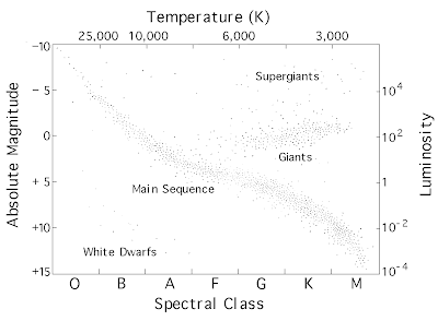
The big breakthrough came when Ejnar Hertzprung and Henry Russell plotted the temperatures and luminosities for a random sample of stars and found that almost all stars lie on a line.
 This is known as an HR diagram and is something like the Rosetta stone for the stars. It says that for most stars, if you know the star’s temperature then you also know its luminosity and vice versa. This can only be true if all stars of a certain temperature are the same physical size.
Stars off this line are either old dying stars or stars that have had some wild life experiences (like merging with another star or surviving a supernova). The vast majority of stars are the main sequence stars that sit nicely along the line. If you want to see how stars evolve, try playing with this stellar evolution simulator from the University of British Columbia and watch for a future post on stellar evolution.
So why can’t you build a bigger star but keep the temperature the same? It all comes down to the fundamental balance between gravity and the other three fundamental forces. If you add more mass to a star, the gravitational forces increase, driving up the temperature and pressure in the star’s core. This causes nuclear fusion to become more efficient, which produces more energy, driving the luminosity up and heating the star’s surface. In essence, the HR diagram proved that stars are defined by their mass.
Nick, that is all really interesting. I enjoyed the simulator.
ReplyDeleteIt is astonishing what physical insight can jump out at you simply by plotting two random variables together.
Joe, welcome to all of astronomy, plotting two random variables together.
ReplyDeleteI don't think we can stress just how important the HR Diagram is for astronomy. I estimate that about half of the research in astronmy comes from plotting stars on a HR Diagram. It is something that tells us a lot about the universe.
One of the hardest parts of using the HR Diagram is having to deal with the Inter Stellar Medium (ISM). The ISM affects the light from stars (i.e. makes them redder or bluer than they actually are) and thus when we plot them on the HR Diagram they end up in the wrong place. This causes all kinds of problems such as estimating the wrong age for a population of stars, or an incorrect distance, or even getting the wrong type of stars. Because these are very real problems a lot of research effort goes into accounting for and fixing these problems.
"Joe, welcome to all of astronomy, plotting two random variables together."
ReplyDeleteRyan, I about died from laughter when I read this. I am glad you guys are discussing this stuff.
You'll also note that in true astronomical fashion, the plot I have include uses logarithmic scales and has labels on all four axis. Astronomers are great at putting so much data on a single plot as to make it nearly incomprehensible.
ReplyDeleteYes, if it isn't log *base 10* along at least one axis, it isn't a real astronomy plot. (Ln doesn't count being base e.)
ReplyDeleteNot to mention how intuitive the spectral class classification system is. Yes, 'O' then 'B' then 'A' then ... makes so much sense.
ReplyDeleteYou need a post dedicated to your favorite way of remembering all these classification schemes.
Ahh Joe you read my mind. My next post in this series will be titled "Oh Be A Fine Gal, Kiss Me".
ReplyDeleteExcellent!
ReplyDeletenicky can you guess me? I'll give you a hint. I cure swine flu like somebodies recent problems they told everyone. Also my real name begins with Tam so it is good I give swine flu cures like well you know silly, Tamiflu!
ReplyDelete